RLT · Healthcare SaaS Design System

Rebuilding a fragmented
design system into
scalable architecture

100+Components reviewed and optimized
30+Navigation variants consolidated
Role
Design System · Product Designer
Scope
System Audit · Architecture · Variables · Component Refactoring · UX Consultation
Product
Healthcare SaaS platform for clinics and healthcare professionals
Engagement
3 months establishing the core system

Context

Evolving the system alongside the product

The platform had been used for several years by healthcare professionals and clinics to order oncology treatments such as Pluvicto and coordinate related services, including radioactive byproduct collection. As it evolved from a content- and service-oriented platform into a richer SaaS product, I joined early to restructure the design system while also contributing UX input across the product. The library still worked, but years of growth had created duplication, inconsistent styling, fragile overrides and weak discoverability.

The product was becoming more sophisticated. The system underneath it needed to do the same.

System Problems

A functioning system that had become increasingly difficult to evolve

The platform had grown around a large set of inconsistent components and navigation patterns. As new product and brand requirements accumulated, local fixes created duplication, visual drift, and higher implementation effort. The challenge was not simply to redesign individual interfaces, but to create a system that could absorb future change without multiplying exceptions.

Existing friction

Component proliferation

Similar interaction needs had accumulated as separate components rather than a coherent family. Even basic elements like buttons existed across multiple structures, while navigation had grown to 30+ variants.

Fragile architecture

Deep nesting and complex inheritance made simple changes unpredictable. Overrides and interaction states could break, with stroke-based icons adding further inheritance issues.

Inconsistent styling

Visual values were applied too locally across the system. Without a shared semantic structure, global changes required unnecessary component-level maintenance.

Weak discoverability

The library had grown as a collection of components rather than a clearly structured system. Weak taxonomy and file hierarchy made components harder to find and reuse consistently.

Constraints

Rebuilding the system meant balancing present product needs with future scalability.

The architecture had to improve a live product without disrupting ongoing work, while also preparing the system for broader product and brand change.

Live product

Built on an existing product, not a blank canvas.

Product evolution

The redesign introduced richer SaaS workflows and interaction patterns.

Existing design debt

Core components already carried duplication, nesting, and inconsistency.

Brand evolution

The system needed to absorb upcoming visual evolution without rework.

Audit Findings

The library had components, but not enough architecture

Evidence

Similar functions existed as independent components and variants, while weak taxonomy made their relationships unclear.

Implication

The system needed a clear hierarchy for foundations, components and patterns.

Styling was tightly coupled to implementation

Evidence

Colors and other visual values were inconsistently applied while a broader brand evolution was still ahead.

Implication

Visual values needed to be separated from semantic meaning so changes could scale across the system.

More abstraction was creating less flexibility

Evidence

Deep nesting and inheritance chains made overrides fragile, while some interaction elements could break expected behavior.

Implication

The architecture needed fewer dependencies, clearer boundaries and simpler component structures.

Architecture Strategy

Rebuild the relationships, not just the components

Instead of fixing inconsistencies individually, I reorganized the system around three architectural levels:

Level 01

Foundations

Shared variables, typography, spacing, grids and visual rules.

Level 02

Components

Reusable interface elements built on those foundations.

Level 03

Patterns

Reusable structures for navigation, layouts, wrappers and side panels.

Decoupling meaning from visual values

The semantic direction was established collaboratively. I translated it into a three-layer variable architecture.

Layer 01

Base values

Raw visual values lived at the base level.

Layer 02

Semantic tokens

Semantic variables described their purpose.

Layer 03

Component bindings

Components referenced semantic roles instead of raw values.

Key decisions

Coherent

Consolidate by purpose, not appearance

Years of growth had created multiple controls for similar actions. I grouped components around shared behavior and states, preserving meaningful differences while removing historical duplication.

Adaptable

Keep semantics stable while visuals change

The visual direction was still evolving, so components could not depend directly on the current palette. Semantic roles created a stable layer between raw values and component styling.

Predictable

Remove abstraction where it reduced control

Deep nesting and inheritance made overrides fragile. I simplified component boundaries, reduced unnecessary dependencies, and flattened interaction elements where abstraction created problems.

Reusable

Standardize structure, not entire screens

Recurring layouts needed consistency without turning into rigid templates. I introduced reusable shells, wrappers, panels, and page structures that could adapt to different workflows.

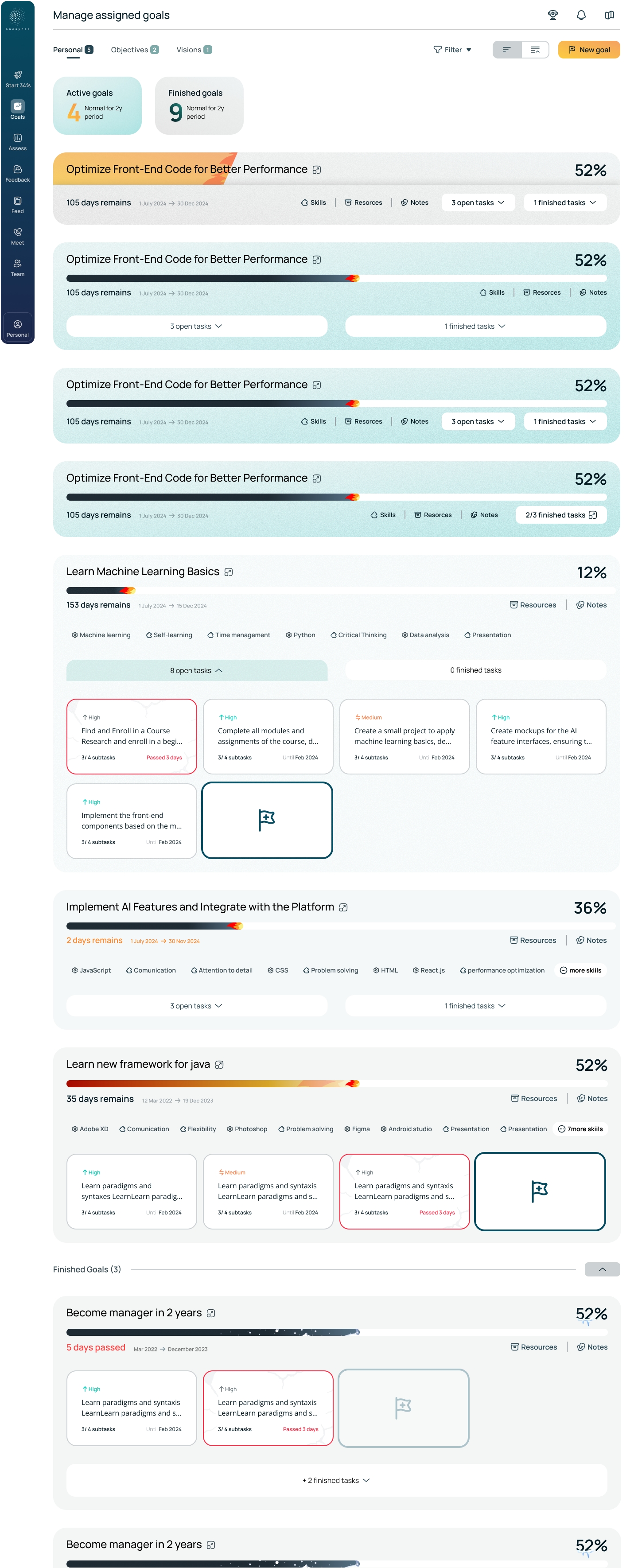
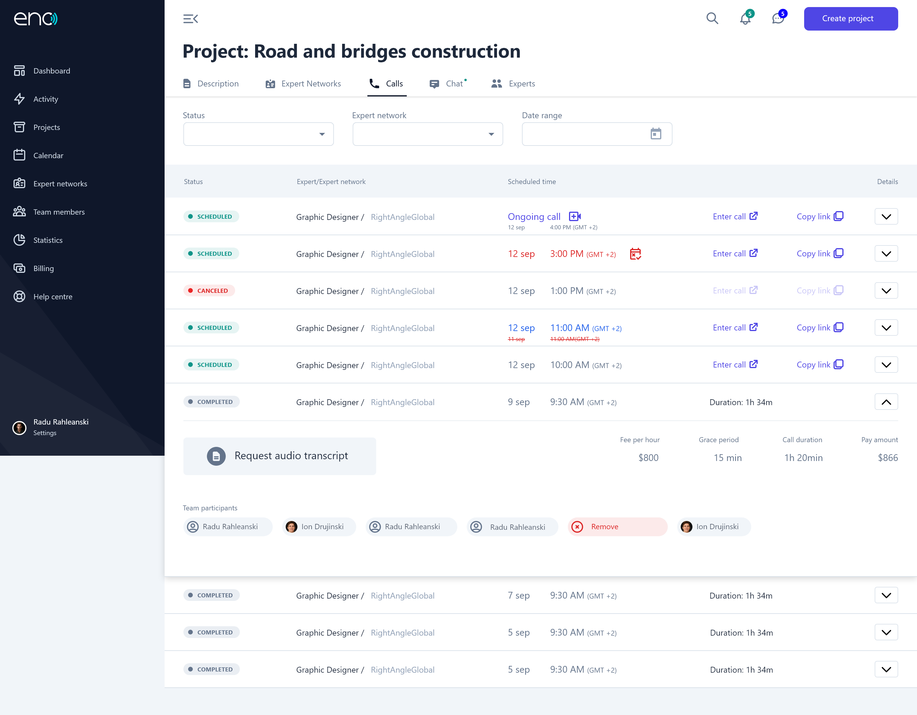
System Walkthrough

Impact

100+
Components reviewed and optimized

Reduced duplication and structural debt.

30+
Navigation variants consolidated

Created a clearer, more consistent navigation system.

Reliable
Overrides and interaction states

Simplified structures made components more predictable.

Flexible
Product and brand evolution

Layered variables made future changes easier to absorb.

Reflection

What I would push further

  1. 01Stronger governance
  2. 02Adoption measurement
  3. 03Accessibility validation

What this project reinforced

  • Structural clarity matters more than adding more components.
  • Simpler architecture often scales better than deeper abstraction.
  • Design systems work best when they evolve alongside real product needs.

Check other cases